Today we start a news blog series regarding app configuration using the Simplifier. After the login our sample application will aggregate fault messages from the connected SAP system when the user searches for the corresponding notification number. It’s quite a simple example but you will see how app development will change due to configuration with the Simplifier. The first episode will deal with the User Interface and the navigation between the screens.
The idea
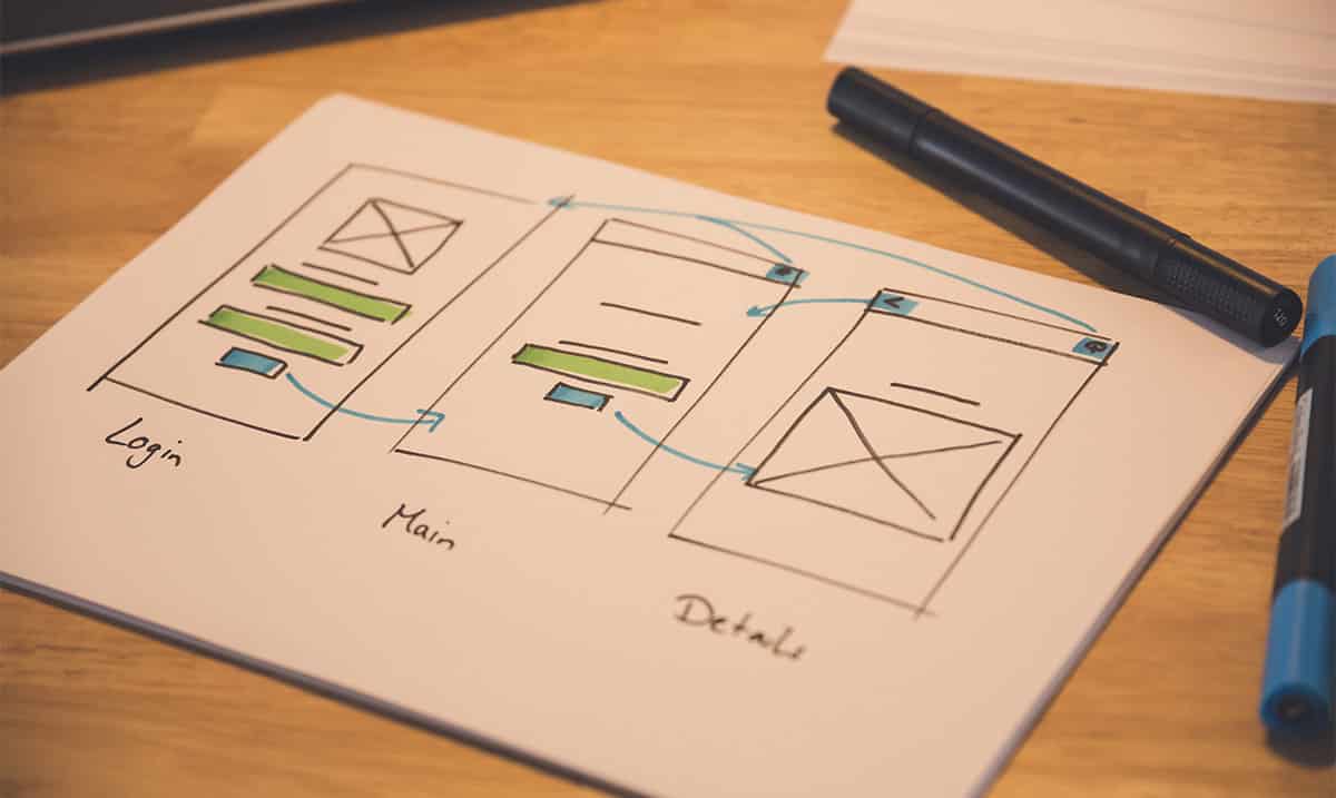
Every app, even enterprise apps, start with an idea. Then there comes the concept. Despite rapid prototyping with the Simplifier it makes sense to sketch a draft on paper or to use a prototyping tool. So you will see exactly how many screens and navigation steps you need.
Starting with the Simplifier
After the login the user can see the dashboard. The number of tiles depends on the authorization of the user. Right from the start there are no apps. When the user wants to create a new application he must choose what kind of app he’d like to configure. We select an OpenUI5 mobile app. When configuring for smart phones or tablets that’s the right choice. OpenUI5 portal apps, as the name suggests, are used for browser-based portal applications. Choose Angular when you want to configure for wearable devices such as smart glasses or smart watches.
Now we give a name to our app and set a short description which can be shown in the app overview. The app transport name is created automatically but it’s only needed when you want to transport your app from one instance to another for example when bringing it from development system to test system. Once the app is created, it can be selected from the app overview to start the configuration.
Creating screens
Due to the concept the user knows exactly how many and which screens he need to create for the app. Especially when you want to create an app with lots of screens you should focus on useful naming. Otherwise, when facing screen 1 to screen 26 one can easily lose the overview.
The login screen
What’s a login screen? Well, we pretend to be stupid and say a login screen is a screen where users log in. So, what we need at a minimum are two input fields, one for the user name, the other for the individual password. The superordinate central layout ensures that all elements are positioned centrally. But maybe the user needs the information where to enter which data? When highlighted by bold font every user should know. To complete the screen we place a picture.
The main screen
This is where the application really starts. The welcome-label greats the user, the label TicketNr. requests the ticket number. So of course we need another input field and a search button that sends the information into the SAP system. For the search button we choose the well-known search icon. The fixed width of button and input field ensures a consistent picture. In the HeaderBar the superordinate menu bar of the application we place the logout button. It’s important to activate the checkbox Visual Script to transfer the button into the next part of the SImplifier where the navigation is configured. Otherwise it won’t appear here, but more about that later.
The detail screen
Now the HeaderBar starts to get complex. Beside the logout-button we also configure a back-button which brings the user to the previous screen. Beside that there’s not much new. An output field will hold the value aggregated from the SAP system later. Now the UI can be saved.
Let the clicking begin
To interconnect the screens we need a navigation. After all, a login-button should bring the user to the first screen of the application and the back-button is said to bring the user to the previous screen. You really should stick to those conventions when you want your application to be accepted.
As our demo app isn’t that complex the navigation is easy as well. We need five navigation steps, two forward and three backwards. To configure the navigation between two screens we choose an Event (this is pressing a button) and assign the event to the button. For the field Navigation we choose the target screen. Now we can preview the application and check whether all navigation is correct or not.
For now our application looks good.

